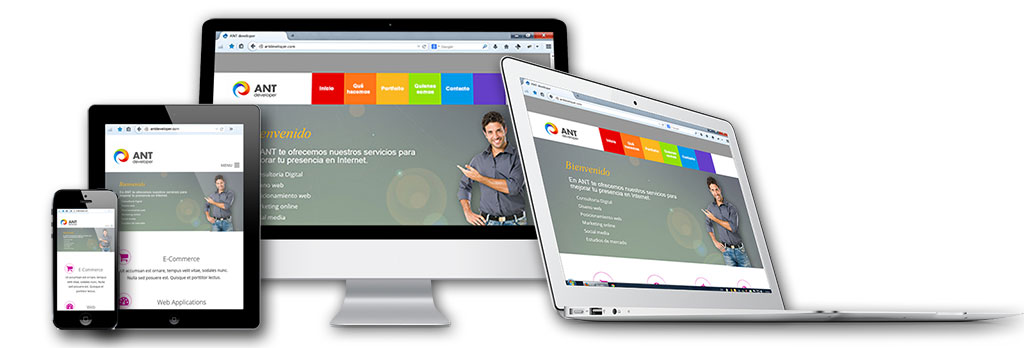
How your website looks on mobile?
In 2013 Internet browsing through mobile and tablets already occupied 28% of the total. It is clear that this percentage will continue to grow.
Responsive Design is a technology that adapts submitting your website to any device. Depending on the size and resolution of the device the -photos content, videos, font size, graphics etc. automatically resized so that the user does not have to increase and increase the size of the screen to llerlo or move content from one side another to find what you want.
There are many examples, to check if a site has this technology on a computer just have to gradually reduce the size of the browser tab, if the content is cut without changing it is not responsive, if it changes and adapts if responsive . Try it with this page or with others: www.hertzenergyservices.com.